image
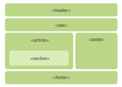
布局方法 过时的布局方法
传统的布局方法
前沿的布局方法
弹性盒子布局(Flexible Box Layout)
网格布局(Grid Layout)
经验之谈 布局可以从以下几个方面思考:
利用 float + margin 实现
利用 absolute 绝对定位实现
利用 BFC 实现
利用 Flexbox 实现
利用 Grid 实现
几个注意点:
移动端能用 Flex 就用 Flex,灵活方便并且功能强大,无愧为网页布局的一大利器!
使用 float 时,注意要清除浮动,避免高度塌陷
避免使用老旧的 table 布局(如 display: table;、display: table-row;、display: table-cell;)。表格布局会使 margin 失效,设置间隔比较麻烦。
居中布局 水平居中 行内元素水平居中:
1 2 3 4 5 6 .inline-x-center { text-align : center; }
单个块级元素水平居中:
1 2 3 4 5 6 7 @mixin margin-auto-center($width : 80% ) { width : $width ; margin-left : auto; margin-right : auto; }
多个块级元素水平居中:
注意多个 inline-block 元素间空白字符 font-size 不为 0 的问题
1
2
3
4
5
6
7
8
.parent { text-align : center; } .child { display : inline-block; }
垂直居中 行内元素垂直居中:
1
2
3
4
.inline-y-center { height : 40px ; line-height : 40px ; }
垂直对齐一幅图像、字体图标:
1 2 3 4 .img-y-center { vertical-align : middle; }
水平垂直居中
总结:一般情况下,水平垂直居中,我们最常用的就是绝对定位加负边距,缺点就是需要知道宽高,使用 transform 倒是可以不需要知道宽高,但是兼容性不好(IE9+)
高度宽度已知:
1 2 3 4 5 6 7 8 9 10 @mixin margin-center($width , $height ) { position : absolute; top : 50% ; left : 50% ; width : $width ; height : $height ; margin-left : -($width / 2 ); margin-top : -($height / 2 ); }
高度宽度未知:
1 2 3 4 5 6 7 8 9 .transform-center { position : absolute; top : 50% ; left : 50% ; transform : translate(-50% , -50% ); }
1 2 3 4 5 6 7 .flexbox-center { display : flex; align-items : center; justify-content : center; }
1 2 3 4 5 6 7 .grid-center { display : grid; align-items : center; justify-content : center; }
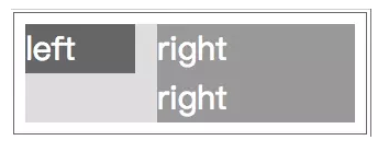
两列布局
image
左列定宽,右列自适应
利用 float + margin 实现:
1
2
3
4
5
6
7
8
.left { float : left; width : 100px ; } .right { margin-left : 120px ; }
利用 BFC 实现:
BFC(Block fomatting context):块级元素格式化上下文,它决定了其子元素将如何定位,以及和其他元素的相互关系。
BFC 在页面上是一个独立的容器,与其他元素互不影响
1
2
3
4
5
6
7
8
.left { float : left; width : 100px ; } .right { overflow : hidden; }
利用 absolute 绝对定位实现:
1
2
3
4
5
6
7
8
9
10
11
12
13
14
15
16
17
.parent { position : relative; } .left { position : absolute; top : 0 ; left : 0 ; width : 100px ; } .right { position : absolute; top : 0 ; left : 100px ; right : 0 ; }
利用 Flexbox 实现:
1
2
3
4
5
6
7
8
9
10
11
12
.parent { display : flex; } .left { width : 100px ; flex : 0 0 100px ; } .right { flex : 1 ; }
利用 Grid 实现:
1
2
3
4
5
.parent { display : grid; grid-template-columns : 100px auto; width : 100% ; }
左列自适应,右列定宽
利用 float + margin 实现:
1
2
3
4
5
6
7
8
9
10
11
12
13
14
15
.parent { height : 500px ; padding-left : 100px ; } .left { float : left; margin-left : -100px ; width : 100% ; } .right { float : right; width : 100px ; }
利用 BFC 实现:
1 2 3 4 5 6 7 8 9 10 11 12 13 14 15 <style > .left { overflow : hidden; } .right { float : right; margin-left : 10px ; width : 100px ; } </style> <!-- right 先渲染 -- > <div id="right">右列定宽</div> <div id="left">左列自适应</div>
利用 absolute 绝对定位实现:
1
2
3
4
5
6
7
8
9
10
11
12
13
14
15
16
17
.parent { position : relative; } .left { position : absolute; top : 0 ; left : 0 ; right : 100px ; } .right { position : absolute; top : 0 ; right : 0 ; width : 100px ; }
利用 Flexbox 实现:
1
2
3
4
5
6
7
8
9
10
11
12
.parent { display : flex; } .left { flex : 1 ; } .right { width : 100px ; flex : 0 0 100px ; }
利用 Grid 实现:
1
2
3
4
5
.parent { display : grid; grid-template-columns : auto 100px ; width : 100% ; }
一列不定,一列自适应
盒子宽度随着内容增加或减少发生变化,另一个盒子自适应
这里演示左列不定宽,右列自适应。左列自适应,右列不定宽同理。
利用 BFC 实现:
1
2
3
4
5
6
7
8
.left { float : left; margin-right : 10px ; } .right { overflow : hidden; }
利用 Flexbox 实现:
1
2
3
4
5
6
7
8
9
10
11
12
.parent { display : flex; } .left { margin-right : 10px ; } .right { flex : 1 ; }
利用 Grid 实现:
1
2
3
4
5
6
7
8
.parent { display : grid; grid-template-columns : auto 1 fr; } .left { margin-right : 10px ; }
三列布局 两列定宽,一列自适应
利用 float + margin 实现:
1
2
3
4
5
6
7
8
9
10
11
12
13
14
15
16
17
18
.parent { min-width : 310px ; } .left { float : left; margin-right : 10px ; width : 100px ; } .center { float : left; width : 200px ; } .right { margin-left : 320px ; }
利用 BFC 实现:
1
2
3
4
5
6
7
8
9
10
11
12
13
14
15
16
17
18
19
.parent { min-width : 320px ; } .left { float : left; margin-right : 10px ; width : 100px ; } .center { float : left; margin-right : 10px ; width : 200px ; } .right { overflow : hidden; }
利用 Flexbox 实现:
1
2
3
4
5
6
7
8
9
10
11
12
13
14
15
16
17
.parent { display : flex; } .left { margin-right : 10px ; width : 100px ; } .center { margin-right : 10px ; width : 200px ; } .right { flex : 1 ; }
利用 Grid 实现:
1
2
3
4
.parent { display : grid; grid-template-columns : 100px 200px auto; }
左右定宽,中间自适应
image
利用 Flexbox 实现 1 2 3 4 5 6 7 8 9 10 11 12 13 14 15 .parent { display : flex; } .left { width : 100px ; } .center { flex : 1 ; } .right { width : 200px ; }
利用 absolute 绝对定位实现 1 2 3 4 5 6 7 8 9 10 11 12 13 14 15 16 17 18 19 20 21 22 .parent { position : relative; } .left { position : absolute; top : 0 ; left : 0 ; width : 100px ; } .center { margin-left : 100px ; margin-right : 200px ; } .right { position : absolute; top : 0 ; right : 0 ; width : 200px ; }
圣杯布局 圣杯布局又叫做固比固布局,即两边固定宽度,中间自适应的三栏布局。
具体操作是三栏全部浮动,左右两栏负 margin 让其跟中间栏并排。
注意:中间栏要在放在文档流前面以优先渲染。
1 2 3 4 5 6 7 8 9 10 11 12 13 14 15 16 17 18 19 20 21 22 23 24 25 26 27 28 29 30 31 32 33 34 35 36 37 38 39 40 41 42 43 44 45 46 47 <div class ="grail" > <div class ="middle" > Lorem ipsum dolor sit amet, consectetur adipisicing elit. Qui, ut.</div > <div class ="left" > left</div > <div class ="right" > right</div > </div > <style > .grail { box-sizing: border-box; width: 100%; min-width: 1024px; height: 400px; padding: 0 300px; background-color: darkseagreen; } .middle { float: left; width: 100%; height: 300px; background-color: deepskyblue; } .left { float: left; position: relative; left: -300px; width: 300px; height: 300px; margin-left: -100%; background-color: red; } .right { float: left; position: relative; right: -300px; width: 300px; height: 300px; margin-left: -300px; background-color: red; } </style >
双飞翼布局 事实上,圣杯布局和双飞翼布局是一回事,它们实现的都是三栏布局,但是双飞翼布局可以更好地解决中栏内容超出的情景。
1 2 3 4 5 6 7 8 9 10 11 12 13 14 15 16 17 18 19 20 21 22 23 24 25 26 27 28 29 30 31 32 33 34 35 36 37 38 39 40 41 42 43 44 45 46 <div class ="grail" > <div class ="middle-wrapper" > <div class ="middle" > Lorem ipsum dolor sit amet, consectetur adipisicing elit. Qui, ut.</div > </div > <div class ="left" > left</div > <div class ="right" > right</div > </div > <style > .grail { width: 100%; min-width: 1024px; height: 400px; background-color: darkseagreen; } .middle-wrapper { float: left; width: 100%; height: 300px; background-color: deepskyblue; } .middle { height: 300px; margin-left: 300px; margin-right: 300px; background-color: yellowgreen; } .left { float: left; width: 300px; height: 300px; margin-left: -100%; background-color: red; } .right { float: left; width: 300px; height: 300px; margin-left: -300px; background-color: red; } </style >
多列布局 等宽布局
浮动等宽布局:
1
2
3
4
.column { float : left; width : 25% ; }
弹性盒子等宽布局:
1
2
3
4
5
6
7
.parent { display : flex; } .column { flex : 1 ; }
网格等宽布局:
1
2
3
4
.parent { display : grid; grid-template-columns : repeat (6 , 1 fr); }
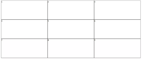
九宫格布局
image
DOM结构:
1 2 3 4 5 6 7 8 9 10 11 12 13 14 15 16 17 <div class ="parent" > <div class ="row" > <div class ="item" > 1</div > <div class ="item" > 2</div > <div class ="item" > 3</div > </div > <div class ="row" > <div class ="item" > 4</div > <div class ="item" > 5</div > <div class ="item" > 6</div > </div > <div class ="row" > <div class ="item" > 7</div > <div class ="item" > 8</div > <div class ="item" > 9</div > </div > </div >
使用 table 表格布局实现:
display:table 相当于 table 标签
display:table-row 相当于 tr 标签
display:table-cell 相当于 td 标签
1
2
3
4
5
6
7
8
9
.parent { display : table; } .row { display : table-row; } .item { display : table-cell; }
使用 Flex 弹性盒子布局实现:
1
2
3
4
5
6
7
8
9
10
11
.parent { display : flex; flex-direction : column; } .row { display : flex; flex : 1 ; } .item { flex : 1 ; }
使用 Grid 网格布局实现:
1
2
3
4
5
.parent { display : grid; grid-template-columns : repeat (3 , 1 fr); grid-template-rows : repeat (3 , 1 fr); }
栅格系统 1 2 3 4 5 6 7 8 9 10 11 12 13 14 15 16 17 18 19 20 21 22 23 24 25 26 27 28 29 30 31 32 33 34 @media screen and (max-width: 768px ) { .column-xs-1 { width : 8.33333333% ; } .column-xs-2 { width : 16.66666667% ; } .column-xs-3 { width : 25% ; } .column-xs-4 { width : 33.33333333% ; } .column-xs-5 { width : 41.66666667% ; } .column-xs-6 { width : 50% ; } .column-xs-7 { width : 58.33333333% ; } .column-xs-8 { width : 66.66666667% ; } .column-xs-9 { width : 75% ; } .column-xs-10 { width : 83.33333333% ; } .column-xs-11 { width : 91.66666667% ; } .column-xs-12 { width : 100% ; } } @media screen and (min-width: 768px ) { .column-sm-1 { width : 8.33333333% ; } .column-sm-2 { width : 16.66666667% ; } .column-sm-3 { width : 25% ; } .column-sm-4 { width : 33.33333333% ; } .column-sm-5 { width : 41.66666667% ; } .column-sm-6 { width : 50% ; } .column-sm-7 { width : 58.33333333% ; } .column-sm-8 { width : 66.66666667% ; } .column-sm-9 { width : 75% ; } .column-sm-10 { width : 83.33333333% ; } .column-sm-11 { width : 91.66666667% ; } .column-sm-12 { width : 100% ; } } div [class^="column-xs-" ] { float : left; } div [class^="column-sm-" ] { float : left; }
滚动场景 横向滚动:overflow-x: auto;
纵向滚动:overflow-y: auto;
横向、纵向滚动:overflow: auto;
更复杂的滚动场景可以借助第三方库实现,如 better-scroll